00:00
00:00
beastkid7
Blurb about . . . me? he he blurb is a funny word.

John Murray @beastkid7

Age 31, Male

secret agent...shhhh

New York

Joined on 4/23/08

Level:
9
Exp Points:
822 / 900
Exp Rank:
79,539
Vote Power:
5.13 votes
Art Scouts
1
Rank:
Civilian
Global Rank:
92,104
Blams:
12
Saves:
47
B/P Bonus:
0%
Whistle:
Normal
Medals:
124
Supporter:
11m 29d
Gear:
5

The new redesign: Pros and cons

Posted by beastkid7 - February 8th, 2012


Things I'm missing. That they may or may not be planning to fix:

The way things loaded!! SERIOUSLY ..I loved how it was a little bit gradual with everything. Like when you posted a comment or uploaded an image.( that glowing wave bar of awesome) and the [Jack in!] button *nodes* ...really really was original

BANNERS ..was that one thing that you said when you first saw it u said .."HEY ..I can customize this?? shweeet." it was another original thing, and people did a lot of cool things with it to personalize there user image.

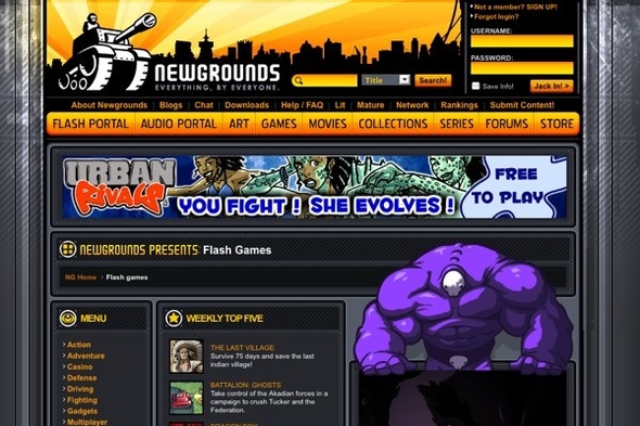
Don't get me wrong, this new design looks great but ..its so flashy, vibrant and visually stimulating. I think I'm mainly talking about the saturated orange illustration in the background. But I'm sure that'll be changed.

I really don't like how your user image gets replaced by and ad when you click on the comments smh ...i just don't
-----

Things I'm looking foward to using. That may or may not be ready to use:

The NOTIFICATION SYSTEM is something I've actually been waiting for NG to get on. It brings the community together when you can more easily know if someone replied to you, or Favorited your art ...uno? Because I always hated the fact that I have to visit each one of my submissions if I were to ever see if any thing new was going on as far as comments or reviews.

Project system sounds really awesome! The creative community man, thats why I joined NG at first. The calabs and such. Hopefully in the future I'll have the time to get involved in a project.

Fancy emoticons ^^ ..really impressed with these :D

Being able to find the game I'm looking for

File tolerance. A wider range of file types will be greatly appreciated.
-----

I know it's going to be really amazing!! But right now I think it's pretty cool ^^ I already miss the old one ...but I'm just sentimental.

.
.
"When you are through changing, you are through" -some random guy from Brainyquote.com hehejk ..Bruce Barton

The new redesign: Pros and cons


Comments

well yeah, i am pretty curious to watch as things shortly change.

Good thoughts!

yeh, thanks! I don't want to jump the gun, hasn't even been one day yet. Just saying what I feel

Agreed with you. I really want the old design back, I mean the new design is good and all, but yeah, the old one was way better. I also miss that orange glowing bar. Also hate that they no longer have the score and popularity ranks either, plus you can't see how many people voted on your submission. They really should let you choose between the new and old look

Well I don't necessarily want it back. Its gona take some adjustment and I think they'll fix thos things yer talk'n bout ..if its the general consensus.

Choose lol that'll never happen. Its called moving forward my friend. You loose a little and hopefully gain alot.

theres also the secrets that u unlockby lvln an stuff i cant find it

You sure didn't take your time to right that comment lol had to reread it, but I get what your saying ..sounds cool.

Im mostly gonna miss the recent submissions list and the old school flash on the front page. But its beautiful and snazzy(?). Though at glance from the front page it felt a little cold and mainstream now. Thats judging the cover. Inside I already know its awesome. But I wonder if it had looked this way when I first visited back in 06/07 I probably wouldn't have been so interested to join.

It is alot more shiny wich I don't really love all that much. But it still maintains that "our goal is to be awesome" type look it seemed to always have.

I like the look, but I prefer the technicalities of the old newgrounds.

same here ...ish. idk I like the old look two. I'm just the type of person that doesn't like flashy shiny things.

I just went to the art portal. It funny how most of the most popular and top rated submissions involve an erotic display of female organs.

ino right lol surprise surprise

Functionally, it performs better.

It also STRONGLY shows the rating of each game.

Granted, it's going to get some getting used to knowing where things are.

You might be able to edit the "wall-art" later on for your own page. Similar to how facebook works.

DUDE, if you could do thaaat?? ...who cares about Banners lol